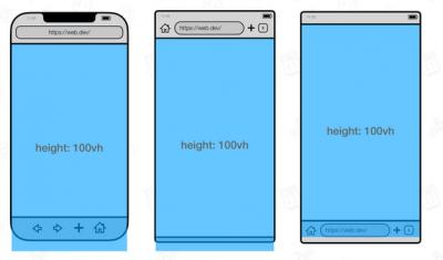
I learned about different viewport heights yesterday, which means you get to read about it today (and apologies if this is old news to anyone). A lot of web design is based on the height of the screen - the viewport. But on mobile phones, the height of the screen changes as the browsers expands or shrinks things like the address bar or menu buttons. This means, for example, if your website is defined as 100vh (that is, 100% of the viewport height) the top of it will be hidden behind the address bar. So if you're designing for a mobile browser, you need choose between the large (lvh), small (svh) or dynamic (dvh) viewport size. Each of these has its own tradeoffs.
Today: 0 Total: 469 [] [Share]


