Half an Hour,
Jul 17, 2019
The New York Times today came out with a list of "the 25 works of art made after 1970 that define the contemporary age, by anyone, anywhere." What struck me as most significant was how little any of the works meant to me.
Most of them I had never heard of. All of them spoke of an experience or a way of experiencing the world that is alien to me. The list feels like a collection of paper cut-outs that proclaim themselves to be the definitive representation of the digital age. Now to be clear: I am neither an artist nor an art critic, and though I've spent my fair share of time in a museum, I could hardly be said to be educated about art.
But it begs the question - what would I include in such a list. The last 50 years comprises, for me, my lifespan from ages 10 through 60 - it is, in other words, the art of my life (so far). How does my experience of art compare with that of the NY Times curators?
Let's go though the list.
Here's what I'm going to do. I'll list each one of the selections in the Times article and write a short paragraph about it and my response to it. Then I'll offer an alternative image, one that represents what to me counts as "important" art. I'll then explain that choice a bit, and where relevant, draw a comparison between the Times selection and my own selection.
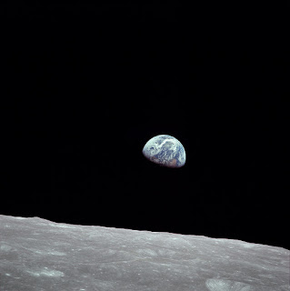
1. They begin with a selection from an artist - Elaine Sturtevant - that copies other artists supposedly "to skewer the grand modernist myths of creativity and the artist as lone genius." Post-modernist that I am, and not needing to skewer the past to make the point, and on this day, the 50th anniversary of the launching of the Apollo 11 mission, I'll present image number one:
Earthrise. By NASA/Bill Anders - This is a retouched picture, which means that it has been digitally altered from its original version. Modifications: rotation, cropping, level adjustment, dirt removal. Modifications made by Earthsound. The original can be found here., Public Domain, Link
Technically, this comes from 51 years ago, but it's an appropriate representation for everything that followed. The lunar landing was a massive achievement, notable for the first step of one man - Neil Armstrong - but which could not have been achieved without the unique and varied contributions of thousands.
Rather than looking at the past and criticizing, Earthrise looks forward and unifies. It leads to Carl Sagan's Pale Blue Dot, to the miracle of Apollo 13, and so much more. It represents everything I have wanted to be in my life, and everything I have ever believed about humanity. And if there is anything in the last 50 years that speaks for us collectively, it is this image.
2. Number two on the Times list is Marcel Broodthaers's nomadic museum, the "Musée d'Art Moderne, Département des Aigles." Just as the voters of the Oscars love movies that reflect the art of making movies, so also artists and curators love art that reflects the making and display of art. But it says a lot less to the rest of us, and actually feels somewhat self-indulgent. My second work of art is the opposite of that.
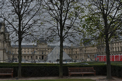
The Louvre. Photo by the author, 2017. Pyramid design by I.M. Pei, inaugurated on 15 October 1988.
The Times list doesn't actually contain any architecture, which given the history of the last 50 years is a little but astonishing, but in keeping with the paper cut-outs theme of the sections. Here I present a work of art that is iconic, that is an actual real museum, and which succeeds in blending the contemporary with the historical in a way that respects both.
The design is reflected in the reconstruction of the Reichstag, completed in 1999. The latter has a glass dome replacing the original dome, which was destroyed during the war. I remember at the time when it opened being told it was designed this way to reflect openness and transparency - the new values that a reunified Germany would present to the world. In the same way, I.M. Pei's pyramid lets us look into the museum from outside. Art, like government, isn't to be hidden and locked away, but shared with the people.
It is no coincidence, I think, that the Louvre is synonymous not only with art but with artistry. It is where the Mona Lisa hangs. It represents the best of us. As Lorde sings, "We're the greatest, they'll hang us in the Louvre, down the back, but who cares, still the Louvre."
3. Third on the Times list is Hans Haacke's "MoMA Poll,"in which museum-goers voted on "Would the fact that Governor Rockefeller has not denounced President Nixon's Indochina Policy be a reason for you not to vote for him in November?" The story for the Times critics is whether museums would actually show Haacke's work. My focus is by contrast what we thought was acceptable in the 1970s:
Phan Thi Kim Phuc. By Huynh Cong Ut (also known as Nick Ut) - Widely available; This version available at http://www.elenaphotograph.com/blog/noticia.php?id=36, Fair use, Link. June 8, 1972.
I was in my early teens as the Vietnam War raged on. We in Canada were not part of the war, but it was still a part of everyday for all of us, set against the backdrop of the Cold War, the fight against communism, the coup in Chile, the Dirty War, the war in El Salvador, Afghanistan, Angola, and on it goes. All of this was normal in the 1970s and early 1980s.
And it was art - art in the same way film noire was art from the 1920s to the 50s, drawing on the murder and decadence of high society, art in the same way the Iraq War was presented on CNN (I would go down to the Strathcona Hotel and watch it on TV). It was art in the form of the Deer Hunter and Apocalypse Now.
You might think that it is absurd to think of killing all those people and inflicting all that suffering just to create art, and I would agree, but it's no less absurd to thinking of killing and hurting in the name of competing economic systems, which is what those wars were ostensibly about.
4. The fourth selection by the Times panel is Philip Guston's series of nearly 80 cartoons depicting the Richard Nixon's rise and fall. Drawn in 1971, the cartoons didn't actually appear anywhere until 2001. The Times refers to "its enduring relevance" but to me it's parochial and irrelevant, a relic of a point in history the curators can't get past. So for my fourth pick, I selected a cartoon that resonated much more broadly:
On the Internet, nobody knows you're a dog. Image from The New Yorker cartoon by Peter Steiner, 1993, Fair use, Link
The New York Times managed to get through 25 works of art for the last 50 years without one mention of the internet or digital technology. That I managed to make it through to item number four stands as a testament to the fact that half my life was spent in the pre-digital age. This cartoon reflects more-or-less the turning point not only for me, not only for a generation, but for all of history.
We've had talking dogs before and since. We've had cartoons about computers before and since. But what we have, for the first time, is a type of person-to-person communication that could be anonymous. Literally, if a dog had typed the message, you wouldn't know.
Today of course we are in the grip of surveillance capitalism, and there is not much about you that your computer and the networks its connected to doesn't know. So the cartoon represents not only a turning point in history, but also a charming naïvety about what these new tools would portend. The cartoon because for a while an in-joke, and then a slogan, and then a piece of wry cynicism, all within a few years.
5. The next item is a clip from clip from the performance piece staged at Womanhouse by Judy Chicago and Miriam Schapiro. As a whole, Womanhouse is an interesting project - a group of artists basically remodeled a dilapidated building into an art installation to "put on some of the earliest feminist performances and produced painting, craft and sculpture in one radical context." The installation, though, only lasted a month, and mostly doesn't exist any more - a classic case of "you had to be there."
I'm not going to fall into the "it's not art" fallacy here - a lot of art is temporary by its very nature, and transience is by its nature a form of art. Maybe the form of art. I've certainly heard of Judy Chicago, I've certainly been influenced by feminism, including radical feminism, but I think that if there is a better, more representative, and more influential work of art out of this school:
The Dinner Party. Judy Chicago, 1974-1979 - image taken from Google's (new?) arts and culture website. Fair use, link. Also, the Brooklyn Museum.
While the Times selection makes it seem like Judy Chicago and company were inventing something that had never been done before, this installation and contemporary reviews of the work place it firmly in its historical context. Chicago was working within a milieu of emerging radical feminism, something that was both global in nature and rooted in a well-established tradition. The work reminds us at once of artists like Georgia O'Keefe and of contemporaries like Erica Jong.
In The Dinner Party 39 porcelain place settings represent historically important women and feminists. The work went on tour and visited Glenbow Museum, Calgary, Alberta, Canada, December 1982 – February 1983, when I was attending university there. We carried a feature about it in the student newspaper. For me, the lessons in this work blended with Bonnie Sherr Klein's Not a Love Story. The Dinner Party is at once open and welcoming and at the same time strident and unyielding.
I had a lot to learn about feminism in those days and I still have a lot to learn about it today. It has been a long struggle for women and it hasn't ended. Works like The Dinner Party remind us of that, which is why it is important that they endure, and continue to speak to us.
6. For their sixth selection the Times writers choose a nude of Lynda Benglis holding a giant dildo published as an advertisement in the November, 1974, issue of Artforum. The Times article does not include the image "due to its graphic nature" but if you're interested you can see it here. The selection seems to be based more on the "bedlam" caused by the image.
There's a long history of nudes in art, of women expressing their independence by being nude in art, and of men being offended by women being nude in art. Even in 1974 you could see nude women in magazines (in fact, that very same year, as a 14-year old, I got my first taste in the form of a discarded collection of magazines strewn along the side of a highway - I collected them all). So though the Times critics saw this advertisement worthy of note, I think there's a much more important piece of art that speaks to the same issues:
Farrah Fawcett-Majors. Photographer Bruce McBroom, publisher Pro Arts Inc., 1976, Fair use, Link.
I never actually owned a copy of this poster, but that would make me one of few boys my age who didn't, as it became the best-selling poster of all time. The swimsuit itself ended up in the Smithsonian. The poster made Farrah Fawcett a star. She built on her stardom in Charlie's Angels (a franchise that continues to this day).
The poster represented a transition from the badly-kept secret that "sex sells" to the open acknowledgement that "sex sells". What makes the Fawcett-Majors poster and the Lynda Benglis advertisement different from the works of, say, Helmut Newton, is that it is the women themselves making and choosing the image. What they have in common is that the woman in both cases - or, at least, the image of the woman - is the 'product' being sold.
Today of course these images appear quaint, even Lynda Benglis's image appears quaint, and the idea of advertising in magazines definitely appears quaint, but the point where all this became acceptable was the point when we started putting Farrah Fawcett on a poster. And of course, the marketing of women - either by themselves, of themselves, or for others, continues unabated to this day. Following Farrah we have the Dallas Cowgirls, Baywatch, and Brooke Shields at 15 to 1 Night in Paris.
7. The next choice by the New York Times is a photo of a house that was split neatly in two by Gordon Matta-Clark, showing the sunlight between the two halves. It's another temporary installation, lasting only three months before being demolished. There's a lot going on in the background here, though, and while the article presents it as a singular work, it's part of a longer tradition where "feminist art is filled with examples of such construction and deconstruction, often taking literal form as the projections of houses onto bodies and vice versa."
I thought about contrasting this with other accounts where partners have split the wealth between them, with examples ranging from King Solomon to Cambodia, but the comment on one critic - "Why is there no land art?" - led me in a different direction:
Crop Circles. Many artists, many versions, peaked in the 1990s. See Google.
The curators in the Times mentioned some land art, such as "Spiral Jetty" by Robert Smithson - and of course things like sand mandalas were popular over the last half-century, but if there is a type of land art that really belongs to the contemporary age, it's the crop circle.
Though crop circles have a long history (being created by everything from windstorms to fairy rings to humans) the popularity of crop circles was revived in the 1990s by Doug Bower and Dave Chorley. After having had too many been, the pair devised a method of flattening wheat using twine and wood and started the modern phenomenon.
So - why crop circles, when there is so much other land art? To my mind, crop circles are unique in that they touch both the past - with allusions all the way back to Stonehenge - and the future, with their current association with aliens. Also, crop circles, much more than the other examples, are a case of people's art, which to me lends them an authenticity a deliberately constructed work of art qua art doesn't afford.
8. The panel next discusses the "truisms" of Jenny Holzer , which she published and began selling as posters, baseball caps, T-shirts and condoms, including projecting them on the Spectacolor LED board in Times Square in 1982. It must be nice to have that kind of money. It's hard to discern why the panel though Holzer in particular was worth highlighting, except perhaps that it's a blend of hacking memes and mass customization (a la Toffler). I don't really see it as anything than Ben Franklin for today's media.
But today, we express truisms differently:
Rage, Flower Thrower, Banksy, 2003. See more.
I could have selected any number of Banksy pieces, including the best counter-art that I know, the shredding of Girl with a Balloon, but I think this piece is prototypical.
Where Holzer's art seems to cater to the mainstream commodification of art, Banksy does the opposite, placing his art on free public display in a way that's even criminal. And his message is relentlessly counter-institutional.
I had wanted to place the Peace Sign or the Smiley Face into this spot, as both were obviously hugely influential over the last 50 years, but both predate the 1970s. What's significant about them, though, and what is carried on through Banksy is the use - the appropriation, even - of icons to express truisms. Banksy can be blunt with his images in a way that a string of text cannot.
The full influence of Banksy is yet to be felt. We can see echoes of Banksy in the Guy Fawkes mask used by Anonymous and Occupy Wall Street, in the iconography of online memes and LOLcats, and the push to reclaim public spaces for public are (as opposed to inoffensive corporate sculptures)
9. The ninth item is a clip from the video piece in which Dara Birnbaum edited excerpts from the 1970s series "Wonder Woman." We are told "it is difficult to appreciate how radical it was to assemble art out of stolen TV clips 40 years ago." And yet - it isn't, as any person who created a mixtape or a collage will tell you. And frankly, whatever you think of the character, I think there was more art in the creation of the Wonder Woman series than there was in the remixing of it.
But there is art in the whole philosophy of Rip Mix Burn, and one video that stands as the exemplar of all that it stands for and all that it could be:
1984. Apple. Directed by: Ridley Scott, release date: December 31, 1983, production company: Fairbanks Films. View video here.
This video remixes the themes from Orwell's 1984, and the visual style from the 1950s film of the same name, and contrasts it with a more genuine Wonder Woman, an athlete (Anya Major) who throws a hammer at the screen and breaks the monopoly. It spoke to themes of class struggle, the role of women in computers, and (in later campaigns) Apple's promotion of the idea of "rip, mix, burn".
Writes Peter Cohen, "The 1984 ad's success will never be duplicated. It was an event, and part of its impact was because it was so unexpected and so beyond the realm of what had been done before." The computer itself would revolutionize the industry, it would create new tools for art, and new art forms, and the advertisement captures all of this without actually ever saying any of it.
But more - and I think this is important - it ushered in the idea that art is more than just what an artist does. In the Wonder Woman video we have Dara Birnbaum acting alone - as though the ensemble that produced the original television show couldn't have been artists. But with the computer - and especially, with the networked computer - we move beyond that, to the idea that art is something that a community does. This is something I don't think the artists and curators in the Times article really comprehend - which is why we are limited to paper cut-outs and things that can be done by one person with simple tools.
10. The panel discusses two works by David Hammons for its tenth selection, "Bliz-aard Ball Sale I" (1983); "How Ya Like Me Now?" (1988), both depictions of race and racism in American society using "radical, unorthodox materials". The second is a picture of Jesse Jackson as blond-haired and blue-eyed.The theme evokes a obvious comparison with another black politician who ran more successfully and the very influential poster that underlined that campaign:
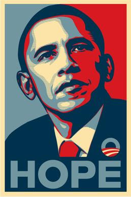
Hope. By Shepard Fairey - Self-made, Fair use, Link. 2008.
It's hard to believe more than ten years have passed since we first say this image. According to Wikipedia, "Fairey found a photograph of Obama using Google Image Search (eventually revealed to be an April 2006 photo by freelancer Mannie Garcia for The Associated Press) and created the original poster design in a single day." It has had a widespread impact since then and captured the core sentiment of the Obama campaign.
Fairey has inspired other street art campaigns, including the Mozilla logo, the Nelson Mandela mural in Johannesburg, Andre the Giant has a Posse and the ubiquitous Obey logo.
11. For the eleventh selection we have two works by Barbara Kruger's "Untitled (When I hear the word culture, I take out my check book)" (1985); "Untitled (I Shop Therefore I Am)" (1987).These mark a return to magazine culture for the panelists: "agitprop images of terse, satirical slogans in white or black Futura Bold Oblique type on close-cropped images primarily from old magazines." The images remind me of silkscreen images or old Andy Warhols or even Fluxus and found art.
I think a lot of the same messages can blend together in a much more original and impactful way:
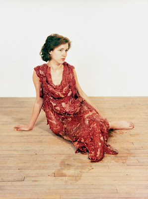
Vanitas: Flesh Dress for an Albino Anorectic. Jana Sterbak, 1987. Fair use. UQAM, Virtual Museum.
Probably many more people commented (and were outraged, etc.) when Lady Gaga wore a meat dress in 2010, but when Jana Sterbak's work was displayed in the National Gallery in Ottawa it generated no less controversy. It at once comments on commercialism, the passage of time and decay, fashion and feminism.
What appeals to me is the wrongness of it - clothing is supposed to cover flesh, not be composed of flesh. But it also points to a hypocrisy - we don't mind clothing outselves in other foods, or in other parts of an animal - only the actual flesh of a flank steak brings out this viscerial reaction. And the social commentary of the display of a woman as - literally - a piece of meat cannot be ignored.
12. The next item in the Times list is Nan Goldin's series of photographs called "The Ballad of Sexual Dependency" (the New York critics have a very limited repertoire, it seems to me). "Her subjects were herself, her lovers and her friends — drag queens, fellow drug addicts, runaways and artists. We see them fight, make up, have sex, apply makeup, shoot up and nod off." This seems to me to be more like voyeurism than art. I would rather celebrate people than expose them:
NAMES Project AIDS Memorial Quilt. By National Institutes of Health - en wikipedia - [1], taken from National Institutes of Health website - here, Public Domain, Link. 1985ff.
This is another example of community art, where each panel of the quilt represents a person who was lost, as contributed by that person's friends or family. According to Wikipedia, it is the largest piece of community folk art in the world as of 2016. Of course, the quilt represents much more than just size.
What I appreciate about the quilt is that it is using art to do more than just criticize and complain. Yes, the quilt has a sharp social message, but I see it much more as a celebration of the lives it represents, not merely a mourning and certainly not merely a lament. The AIDS quilt is a people coming together and demonstrating that even though the losses are large, the accomplishments of a society can be even larger.
13. At the halfway point, we have two works from Cady Noland: "Oozewald," 1989; "The Big Slide," 1989. The former is an enlarged photo of Lee Harvey Oswald depicted when he was shot by Jack Ruby, with enlarged bullet holes representing the eight shots. The latter is a horizontal metal pole with flags and stuff hanging from it. This art again strikes me as very parochial.
I'm going to go in a completely differernt direction:
John Lennon and Yoko Ono. Annie Leibovitz, 1980. Fair use. National Galleries Scotland.
While people of a certain age remember where they were when Kennedy was shot, people my age remember where they were when John Lennon was shot. Though the former really impacted baby boomers in the U.S. (including evidently our art critics) it is arguable that the latter had a far more significant impact on the world. This photo was published on the cover of Rolling Stone. It was taken the day Lennon was shot.
There's so much to this photo - Lennon is naked, Ono is not, Lennon is active, Ono is not, Lennon is vulnerable, Ono is not. It turns the stereotypes of the relation between men and women on its head. It was just after the release of Double Fantasy and marked Lennon's re-emergence as an artist, his mature post-Beatles work cut short. But this photo celebrates the life of Lennon, rather than sensationalizing his death.
Leibovitz, meanwhile, would continue her career as one of the most noted photographers of her era here are some more.
14. The artist did not give his permission to reporduce the work in the New York Times but they named it anyways, running a photo of the artist in its place. It was Jeff Koons, "Ilona on Top (Rosa Background)," 1999, a depiction of Tantric sex. You can see it here, on Koons's website. I actually agree with the selection of Koons in general, but wish the critics could have extended their range a bit. I have two favourite Koons works, and I'm going to pick one here:
Rabbit. Jeff Koons. 1986. Via.
There's a lot going on in Rabbit that helps make it a cultural icon. It is sculpted out of stainless steel, but looks like balloons. It is highly polished, so it reflects the viewer (and the room, and whatever) back at you. It reminds us of other rabbit icons in our culture, ranging from bugs bunny (the carrot) to the Playboy bunny (the rakish ear). It's simple, but it's a type of simplicity that is not simple.
I don't know why the Times thought Ilona on Top was more "important". Maybe it's the idea that it shocks people that makes them think it's important. I don't know. This rabbit is in its own way far more shocking than any overt depiction of carnality, depicting as it does a journey from innocence to something else.
15. Next we have Mike Kelley's "The Arenas," 1990, a series of works, one of which pictured is a set of dingy teddy bears sitting around a carpet. The show and the theme are exactly on point with the tastes of the Times pundits: "The works summon up themes of perversion, shame, dread, vulnerability and pathos." They also represent differences in class and our image of children the way we think of children. Bleah. I thing we can do better with stuffed animals:
Calvin and Hobbes. Bill Watterson, November 18, 1985 to December 31, 1995. Wikipedia.
The cartoon strip, which ran for ten years, is everything I remember my childhood to be, and everything I imagine a child's life is like, in those days of wonder and imagination before some artist with dingy teddybears comes along and spoils the illusion. Calvin and Hobbes isn't just a work of art - though it is most certainly that - it is also a commerntary on what's important, and what's not, in our lives.
I could say so much more about Calvin and Hobbes - but oh, just go enjoy it for yourself.
16. Next up is the pile of candies that is Felix Gonzalez-Torres's "Untitled" (Portrait of Ross in L.A.), 1991. It is, literally, a pile of candies, and visitors can take candies if they want (and presumably eat them) so the installation slowly decreases in size, just as Ross, who was dying of AIDS, did. I get the idea but it feels to me that it lacks a certain commitment. My next pick is a singularly unique body of work:
Let's Dance [Mr. Death Series] (1988) By Manwoman. Fair use. Source.
As with many of the artists in this list, the importance isn't just in the work but in the oeuvre of the artist as a whole. In the case of Manwoman, this collection includes his own body (see this Flickr collection of images). Manwoman lived his art completely, living in central British Columbia and exhibiting in places like the Stride Gallery and Headbones Gallery.
Manwoman gained notoriety for his lifelong effort to reclaim the swaskita. But his life is much more than that, merging art and spirituality, physical and transcendental, man and woman. More here. Manwoman, to me, is about reclaiming our identity and our culture, even those parts of it that seem forever barred by history.
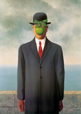
17. The next selection by the Times is Catherine Opie's "Self-Portrait/Cutting" (1993). It is literally a child-like image carved into the artists's back. It depicted two women holding hands, "completing the idyllic domestic dream, which, at the time was just that — a dream — for lesbian couples." I personally see neither the merit nor the importance. Within ten years - and without self-mutilation - same-sex marriage was legal in Canada. The artwork, meanwhile, harkens to themes of trauma and subjugation. Of art as injury and passion. The Times critics eat this stuff up. But these themes, no matter what the critics say, do not make the works of art important.
The Son of Man. René Magritte, 1964. Wikipedia.
This also is a self-portrait, and the author also defaces himself, but he does so figuratively, rather than literally. The title and the apple allude to religion, while the style reminds us of surrealism. And it takes us back to his 1929 work, The Treachery of Images - "Ceci n'est pas une pipe."
Magritte says, "At least it hides the face partly well, so you have the apparent face, the apple, hiding the visible but hidden, the face of the person. It's something that happens constantly. Everything we see hides another thing, we always want to see what is hidden by what we see. There is an interest in that which is hidden and which the visible does not show us."
It is a face that is not a face, an identity that is not an identity.
18. This next selection recognizes the impact of an age where everything is surveiled. In Lutz Bacher's "Closed Circuit" 1997-2000 the artist "installed a camera above (Pat) Hearn's desk, filming continuously for 10 months" as Hearn - her agent - died from cancer. Disgusting. And - frankly - derivative. What captured my imagination in the 1990s was the original:
Jennicam. Jennifer Kaye Ringley, April 3, 1996 - December 31, 2003. Image.
It actually took a few years for Jennicam to take off and become the phenomenon it eventually became. The idea was that Jennifer Ringley would broadcast everything she did in her home live over the internet. Yes, I watched - the idea of being able to peer into someone's life in real time was irresistable. What I saw - and what most viewers saw - was the mundane, the oridinary, repeated day after day. The Wayback Machine has the archive.
Wikipedia says (accurately) "The JenniCam website coincided with a rise in surveillance as a feature of popular culture, exemplified by the 1998 film The Truman Show and reality television programs such as Big Brother, and as a feature of contemporary art and new media art. From a sociological point of view, JenniCam was an important early example of how the internet could create a cyborg subject by integrating human images with the internet. As such, JenniCam set the stage for conversations regarding the relationship of technology and gender."
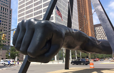
19. Michael Asher's "Michael Asher" exhibit at the Santa Monica Museum of Art in 2008 is next, for his work "recreating the wood or metal skeletons of all of the temporary walls that had been built for the 38 previous exhibitions." Again, what we have are artists and curators finding themselves to be the most fascinating subject possible for "important" art. I'm going for a different definition of "important".
Monument to Joe Louis. Robert Graham, dedicated in 1986. Photo.
Rather than exploring the skeleton of a gallery, I'd rather explore the skeleton of a city. I could name any number of sculptures that do this for a city but this one seems to me to do it best. It speaks to Detroits history, it speaks to the time when we needed to respond to fascism, and it also speaks to the Detroit of today, a city that needs strength, at a time fascism needs to be defeated.
This is the Motor City, said Eminem, and this is what we do.
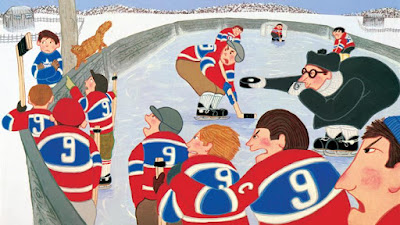
20. The twentieth item has the artists and curators returning to their favourite topics in A.K. Burns and A.L. Steiner's "Community Action Center," (2010), "a celebration of queer sexuality as playful as it is political. We watch as a diverse, multigenerational cast engage in joyfully hedonistic acts of private and shared pleasure involving paint, egg yolks, carwashes and corn on the cob." I don't mean to disparage that community - really, I don't - but for the rest of us, community is something much different.
The Hockey Sweater, written by Roch Carrier, illustrated by Sheldon Cohen, 1979-1984.
There are many ways ypu can break taboos (though the Times critics can think of only a few) and this subject is playfully and lovingly broached in the story The Hockey Sweater (which later became a video, and then an illustrated book). A small boy in rural Quebec lives in a town where everybody wears a Montreal canadien's #9 sweater - that of Maurice Richard - and is sent a Maple Leafs sweater through the Sears catalogue by accident.
"Who do you think you are," the other boys demand. "You think you're better than us?" It takes courage to be different in a small town where everybody is the same, and if the urban environment of New York celebrates the extreme becoming ordinary, the small town life celebrates the ordinary becoming extreme. : « Les hivers de mon enfance étaient des saisons longues, longues. Nous vivions en trois lieux : l'école, l'église et la patinoire; mais la vraie vie était sur la patinoire. » / "The winters of my childhood were long, long seasons. We lived in three places – the school, the church and the skating rink – but our real life was on the skating rink."
Wikipedia. The Hockey Sweater after 30 years. The Hockey Sweater on the Canadian Five Dollar bill.
21. The next selection is 21. Danh Vo's "We the People" sculpture (2010-14), a life-sized replica of the Statue of Liberty, "in 250 pieces, dispersed throughout public and private collections around the world." We read that "In its fragmented state, Vo's statue alludes to the hypocrisy and contradictions of Western foreign policy" It was made in Shanghai. The message and the icon probably resonates more with American audiences. Meanwhile, I have a piece of a rather different work of art with a rather different message:
The Berlin Wall. Various, 1961-1989. Photo by the author.
For the years of its existence the Brrlin Wall was a barrier first and foremost, and only a work of art as an afterthought. After 1989, though, the wall was reclaimed by the people, shattered into a million pieces, and dispersed around the world. I have my own piece of the Berlin Wall here in Casselman. I bought it in 1989 at a trade fair in Edmonton.
Rather than standing as a critique of democracy, the Berlin Wall - in its final dispersed form - became an emblem fo what democracy can be. It wasn't an act of government that painted the wall, nor was it one that dismantled the wall. And I think there's a real difference between a piece of art - even one as elaborate as "We the People" - that is conceived by one artist as a 'statement' and a work of art that actually is a statement.
22. The next item is Kara Walker's sculpture "A Subtlety, or the Marvelous Sugar Baby, an Homage to the Unpaid and Overworked Artisans Who Have Refined Our Sweet Tastes From the Cane Fields to the Kitchens of the New World on the Occasion of the Demolition of the Domino Sugar Refining Plant" (2014). It is "a monumental polystyrene sphinx coated in white sugar" with African-American features and, of course, nipples.
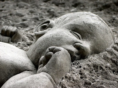
Temple Expiatori de la Sagrada Família. Antoni Gaudí, 1882-present. Photo by the author.
I don't really have an answer to the Sugar Baby, with was impressive (if temporary), but on the monumental scale, no compilation of "important" art over the last half-century would be complete without inclusion of Gaudi's masterpiece, a cathedral that has been under construction more more than a century. I've been privileged to be able to visit it several times while in Barcelona, and to take numerous photos inside and outside.
Though the Sagrada Familia doesn't speak to social issues the way (virtually) all of the Times selections does, it does have commentary on virtually all social issues, from birth to death, war to slavery, peace to passion. But more, the design of the cathedral also represents an attempt to find that fine point of balance where the creations of humanity mirror the patterns of nature. It's a bol vision, and it speaks - still - to the contemporary world. In a very real way, the interaction between man and machine is no different than that between man and nature - we are trying to find our humanity in the heart of the soulless.
Kara Walker, too, seeks to find humaity in the body of the soulless, but it's very much a product of its time and its place.
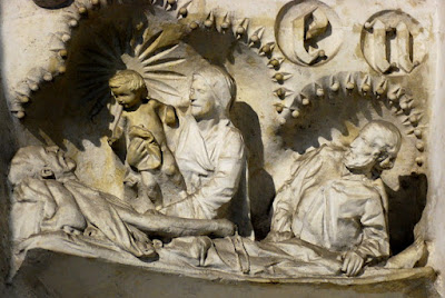
23. The next selection takes us to familiar territory as the Times lists Heji Shin's "Baby" series from 2016. The photos are of babies taken just as they crown and are described as "undeniably gory scene."To me, the photos are just another instance of what might be described as 'medical porn', of which we've seen a lot on TV over the last decade or so. As for bloody babies, there's a memorable scene from The Big Red One (1980) that set a new standard for depictions of childbirth.
Christ Child, also known as In the Beginning or the Millennium Sculpture. Michael "Mike" Chapman, 1999. Wikipedia. Photo by the author.
I suppose I could have selected any number of sculpted babies, but one essential feature of the last 50 years is that it is bisected by the millennium, marked perfectly by this work. "It seemed to me that a tiny life-size baby carved from stone in such an enormous environment would be the best way to remind us all of just whose birthday we were celebrating," said Chapman.
24. The penultimate selection is Cameron Rowland's "New York State Unified Court System," exhibited at at the New York nonprofit Artists Space in 2016. It's another artistic protest: it "exhibited furniture and other objects fabricated by inmates often working for less than a dollar an hour, as well as heavily footnoted research on the mechanics of mass incarceration."But there has been a lot of prison art over the last fifty years, some of it quite recent:
Untitled. Image from Abu Ghraib, author unknown, United States Government, 2003. Story on Wikipedia. Fair use.
This image has become an icon in the early 21st century, and it can be found on walls and posters around the world. It isn't just a commentary on unfair prison practices, it's an actual depiction of real torture at the hands of a nation that has long denied that it does such things. Some might not call the image art - but the Abu Ghraib images were intended as art, with prisoners (and sometimes guards) posed and photographed. It's just art that wasn't meant to be shared with the rest of the world. And it's interesting that the Abu Ghraib artists had the same preoccupations as most of the artists listed in the Times article: torture, degredation, sex.
Having gone through 24 of these works of art so far, I think sometimes that the artists depicted in the Times look inward, at American problems, affective American citizens, but haven't found that ability to look outward, at the wider world.
25. The last "important" work of art listed in the Times article is Arthur Jafa's "Love Is the Message, the Message Is Death," a 2016 "video comprising excerpts from films, television broadcasts, music videos and Jafa's own footage, set to Kanye West's Ultralight Beam." The panel agrees that "Arthur Jafa is coming out of a lineage of collage and photomontage artists" but it's hard to see why Jafa's work is more important than Billy Joel's We Didn't Start the Fire - and Joel at least wrote his own music.
Homecoming Centre (District 6 Museum). Various. District Six Museum Foundation, 1994. Photo by the author, 2006.
For me, the sort of collage that matters most is that which defines a people, as for example in the District 6 Museum, which I was privileged to visit in 2006. There are many individual parts of the museum that might quality in their own right. And the museum as a whole tells the story not only of the forced eviction ofthe black community from this part of Cape Town, but also of the rebuilding and reconciliation that followed the end of Apartheid.
The museum also echos themes that are found in my list of important works of art - art that defines and is defined by a community, art that looks forward as well as back, art that uplifts more than it critiques. Yes, there is great injustice in the world, and it is the role of art to expose it, and shine a light on it, but art must also show the way through that door, and tell us what a better world might look like.
Postscript
I spent the whole day today - from early this morning to well after midnight - writing this article. It involved a lot of reading, a lot of learning, some reminiscing, and quite a bit of thinking about what it is that matters to me.
The picture of art painted by the New York Times panel is very different than the picture of art I would paint for myself. And maybe I'm not educated enough, or sufficiently connected to the community, but it seems to me that the world they see is a very dark, bleak and disturbing version of the world that I see. And it seems to me that they are preoccupied with a very narrow range of topics and issues, and present a very narroe point of view.
As I created my own list I became conscious of the fact that my own list was no less a reflection of my own life and my own culture. So the specific point of view expressed by the panel cannot in itself be a criticism - though the claim to have identified "the 25 works of art made after 1970 that define the contemporary age, by anyone, anywhere" most certainly can be.
And - even - as I look though my own list, as compared to theirs, I not only see a wider range of subjects, people and places, I also see more life, more colour, and more joy. The people I write about wrestle with the same issues, ultimately, as those New York artists, but they do so with more hope and, if I must say, more humanity. Even the terrible images I record here seem to offer more than the visions of blood and hurt and anger expressed by their artists.
Is it because I am more privileged in my house in rural Ontario, Canada? Is it because I have been able to find, and work toward, genuinely helpful ways of expressing myself in the world? Is it because my world is brighter, greener and happier than theirs? I don't know - but it makes me sad that a generation, multiple generations, of people are growing up seeing the world this way.
The best I can do, I guess, is show them my art - what counts as important art for me - the beautiful and the ugly - and let it tell the story of how I came to be who I am. And maybe, between all of us, we can begin to see the world not just as it is, but as it can be.
Mentions
- , Jul 17, 2019, - , Jul 17, 2019
, - , Jul 17, 2019
, - Image editing - Wikipedia, Jul 17, 2019
, - User:Earthsound - Wikimedia Commons, Jul 17, 2019
, - AS08-14-2383 | Apollo 8 Hasselblad image from film magazine … | Flickr, Jul 17, 2019
, - File:NASA Earthrise AS08-14-2383 Apollo 8 1968-12-24.jpg - Wikimedia Commons, Jul 17, 2019
, - Carl Sagan - Pale Blue Dot - YouTube, Jul 17, 2019
, - Apollo 13 - Wikipedia, Jul 17, 2019
, - Marcel Broodthaers. Museum of Modern Art. The Eagles. 19th-Century Section (Musée d'Art Moderne. Les Aigles. Section XIXe siècle). 1969 | MoMA, Jul 17, 2019
, - , Jul 17, 2019
, - Louvre - Wikipedia, Jul 17, 2019
, - Reichstag building - Wikipedia, Jul 17, 2019
, - Lorde - The Louvre - Live In Paris 2017 - YouTube, Jul 17, 2019
, - , Jul 17, 2019
, - , Jul 17, 2019
, - Nick Ut - Wikipedia, Jul 17, 2019
, - , Jul 17, 2019
, - File:TrangBang.jpg - Wikipedia, Jul 17, 2019
, - 1973 Chilean coup d'état - Wikipedia, Jul 17, 2019
, - Dirty War - Wikipedia, Jul 17, 2019
, - Salvadoran Civil War - Wikipedia, Jul 17, 2019
, - Soviet–Afghan War - Wikipedia, Jul 17, 2019
, - Angolan Civil War - Wikipedia, Jul 17, 2019
, - Film noir - Wikipedia, Jul 17, 2019
, - Media coverage of the Iraq War - Wikipedia, Jul 17, 2019
, - The Deer Hunter (1978) - IMDb, Jul 17, 2019
, - Apocalypse Now - Wikipedia, Jul 17, 2019
, - , Jul 17, 2019
, - , Jul 17, 2019
, - File:Internet dog.jpg - Wikipedia, Jul 17, 2019
, - File:Internet dog.jpg - Wikipedia, Jul 17, 2019
, - , Jul 17, 2019
, - , Jul 17, 2019
, - , Jul 17, 2019
, - The Dinner Party by Judy Chicago - Judy Chicago — Google Arts & Culture, Jul 17, 2019
, - Brooklyn Museum: The Dinner Party by Judy Chicago, Jul 17, 2019
, - , Jul 17, 2019
, - Georgia O'Keeffe - Wikipedia, Jul 17, 2019
, - Erica Jong - Wikipedia, Jul 17, 2019
, - Exhibition History « Judy Chicago, Jul 17, 2019
, - Not a Love Story: A Film About Pornography - Wikipedia, Jul 17, 2019
, - Lynda Benglis, Still in Art’s Avant-Garde - The New York Times, Jul 17, 2019
, - Lynda Benglis at Le Consortium - Artforum International , Jul 17, 2019
, - , Jul 17, 2019
, - File:Farrah Fawcett iconic pinup 1976.jpg - Wikipedia, Jul 17, 2019
, - File:Farrah Fawcett iconic pinup 1976.jpg - Wikipedia, Jul 17, 2019
, - The Story Behind the Iconic Farrah Fawcett Red Swimsuit Poster That Wound Up Plastered on Millions of Bedroom Walls ~ vintage everyday, Jul 17, 2019
, - , Jul 17, 2019
, - Iconic 1977 Dallas Cowboys Cheerleaders poster will hang in the Smithsonian | Commentary | Dallas News, Jul 17, 2019
, - Baywatch - Wikipedia, Jul 17, 2019
, - , Jul 17, 2019
, - 1 Night in Paris - Wikipedia, Jul 17, 2019
, - Gordon Matta-Clark | David Zwirner, Jul 17, 2019
, - Body unbuilding: on cuts, stitching and anarchitecture | Thinkpiece | Architectural Review, Jul 17, 2019
, - Judgment of Solomon - Wikipedia, Jul 17, 2019
, - , Jul 17, 2019
, - , Jul 17, 2019
, - , Jul 17, 2019
, - , Jul 17, 2019
, - , Jul 17, 2019
, - , Jul 17, 2019
, - , Jul 17, 2019
, - Hacking memes | Downes | First Monday, Jul 17, 2019
, - Customized Products - Mass Customization | Entrepreneur Hideout, Jul 17, 2019
, - Poor Richard's Almanack - Wikipedia, Jul 17, 2019
, - , Jul 17, 2019
, - "Rage, Flower Thrower" What Banksy's Street-Art Means, Jul 17, 2019
, - Girl with Balloon - Wikipedia, Jul 17, 2019
, - Guy Fawkes mask - Wikipedia, Jul 17, 2019
, - Well-Behaved Street-Corner Sculpture in New York - The New York Times, Jul 17, 2019
, - , Jul 17, 2019
, - 1984 Apple's Macintosh Commercial (HD) - YouTube, Jul 17, 2019
, - Nineteen Eighty-Four - Wikipedia, Jul 17, 2019
, - 1984 (1956 film) - Wikipedia, Jul 17, 2019
, - , Jul 17, 2019
, - , Jul 17, 2019
, - , Jul 17, 2019
, - Shepard Fairey - Wikipedia, Jul 17, 2019
, - File:Barack Obama Hope poster.jpg - Wikipedia, Jul 17, 2019
, - File:Barack Obama Hope poster.jpg - Wikipedia, Jul 17, 2019
, - Google Images - Wikipedia, Jul 17, 2019
, - Mannie Garcia - Wikipedia, Jul 17, 2019
, - Associated Press - Wikipedia, Jul 17, 2019
, - Shepard Fairey - Wikipedia, Jul 17, 2019
, - Nelson Mandela Mural by Shepard Fairey - Wikipedia, Jul 17, 2019
, - Andre the Giant Has a Posse - Wikipedia, Jul 17, 2019
, - Andre the Giant Has a Posse - Wikipedia, Jul 17, 2019
, - Andy Warhol - Wikipedia, Jul 17, 2019
, - Fluxus - Wikipedia, Jul 17, 2019
, - , Jul 17, 2019
, - 1987 - Vanitas: Flesh Dress for an Albino Anorexic by Jana Sterbak | 150 years 150 works, Jul 17, 2019
, - Lady Gaga's meat dress - Wikipedia, Jul 17, 2019
, - , Jul 17, 2019
, - , Jul 17, 2019
, - File:Aids Quilt.jpg - Wikipedia, Jul 17, 2019
, - , Jul 17, 2019
, - File:Aids Quilt.jpg - Wikimedia Commons, Jul 17, 2019
, - Community arts - Wikipedia, Jul 17, 2019
, - The Big Slide | The Art Institute of Chicago, Jul 17, 2019
, - , Jul 17, 2019
, - , Jul 17, 2019
, - Annie Leibovitz on Nine Assignments that Shaped Her Career - Racked, Jul 17, 2019
, - 12 Great Photographs By Annie Leibovitz - John Paul Caponigro – Digital Photography Workshops, DVDs, eBooks : John Paul Caponigro – Digital Photography Workshops, DVDs, eBooks, Jul 17, 2019
, - , Jul 17, 2019
, - , Jul 17, 2019
, - Jeff Koons' 'Rabbit' Fetches $91 Million, Auction Record For Work By A Living Artist | WUTC, Jul 17, 2019
, - Famous Rabbits: Cartoon Bunny and Animated Rabbit Characters, Jul 17, 2019
, - , Jul 17, 2019
, - Calvin and Hobbes - Wikipedia, Jul 17, 2019
, - Today on Calvin and Hobbes - Comics by Bill Watterson - GoComics, Jul 17, 2019
, - , Jul 17, 2019
, - Manwoman | Let's Dance [Mr. Death Series] (1988) | MutualArt, Jul 17, 2019
, - ManWoman - Artist, Poet, Warrior | Flickr, Jul 17, 2019
, - Stride Gallery, Jul 17, 2019
, - ManWoman Pulled, Jul 17, 2019
, - ManWoman Is Taking Back the Swastika - VICE, Jul 17, 2019
, - , Jul 17, 2019
, - , Jul 17, 2019
, - Same-sex marriage in Canada - Wikipedia, Jul 17, 2019
, - The Broken Column - Frida Kahlo — Google Arts & Culture, Jul 17, 2019
, - The Passion of the Christ - Wikipedia, Jul 17, 2019
, - , Jul 17, 2019
, - The Son of Man - Wikipedia, Jul 17, 2019
, - The Treachery of Images - Wikipedia, Jul 17, 2019
, - , Jul 17, 2019
, - , Jul 17, 2019
, - Wayback Machine, Jul 17, 2019
, - Jennifer Ringley - Wikipedia, Jul 17, 2019
, - Big Brother (American TV series) - Wikipedia, Jul 17, 2019
, - Michael Asher, Artist and Teacher, Dies at 69 - The New York Times, Jul 17, 2019
, - , Jul 17, 2019
, - The Real Story Behind Detroit's Giant Joe Louis Fist, Jul 17, 2019
, - Eminem Chrysler 200 Super Bowl Commercial - Imported From Detroit - With Lyrics 1080 HD 2011 - YouTube, Jul 17, 2019
, - , Jul 17, 2019
, - The Hockey Sweater - Wikipedia, Jul 17, 2019
, - , Jul 17, 2019
, - Canada 5 Dollars 2002 (2001-05) - Canadian Currency Bank Notes, North American Paper Money, World Currency, Banknotes, Banknote, Bank-Notes, Coins & Currency. Currency Collector. Pictures of Money, Photos of Bank Notes, Currency Images, Currencies of the , Jul 17, 2019
, - , Jul 17, 2019
, - Kara Walker - The New York Times, Jul 17, 2019
, - , Jul 17, 2019
, - , Jul 17, 2019
, - The Big Red One (1980) - IMDb, Jul 17, 2019
, - , Jul 17, 2019
, - Christ Child (sculpture) - Wikipedia, Jul 17, 2019
, - Essex Street, Jul 17, 2019
, - , Jul 17, 2019
, - Abu Ghraib torture and prisoner abuse - Wikipedia, Jul 17, 2019
, - Billy Joel - We Didn't Start the Fire (Official Video) - YouTube, Jul 17, 2019
, - , Jul 17, 2019
, - Your Art, My Art, Jul 17, 2019

