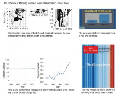
Readers my age will remember Darrell Huff's How to Lie With Statistics (73 page PDF), the examples in which were out of date even when I was in university. This article (54 page PDF) reminds me a lot of that slim book, detailing as it does many of the ways the presentation of data can be manipulative or misleading. Some of the examples are even the same as Huff's: the distorted axis, for example, or combining data. Even so, this would be a valuable addition to any course or program about data literacy or working with data. P.S. Sage Journals brands this as 'Available access'. I don't know what that means. It isn't 'open access'. So maybe download a copy while you can. Via Data Science Weekly, another of the newsletters I troll regularly fo content related to online learning.
Today: 0 Total: 443 [] [Share]


